Typefaces of SkyTrain and TransLink in General
In the past few months, I have had a few people ask me about the wayfinding or the design and typefaces of the signage used on the SkyTrain system. I’ve wanted to talk about this for sometime and since I am on Christmas holiday, I felt like it was time to write about a part of its design language.
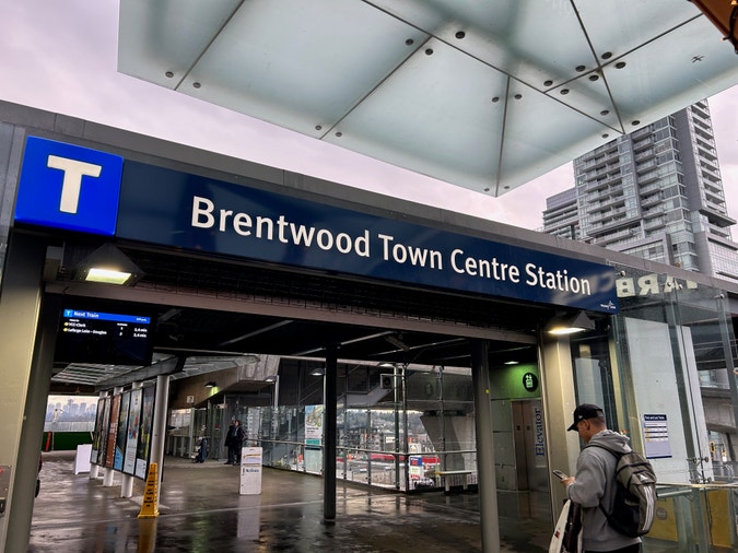
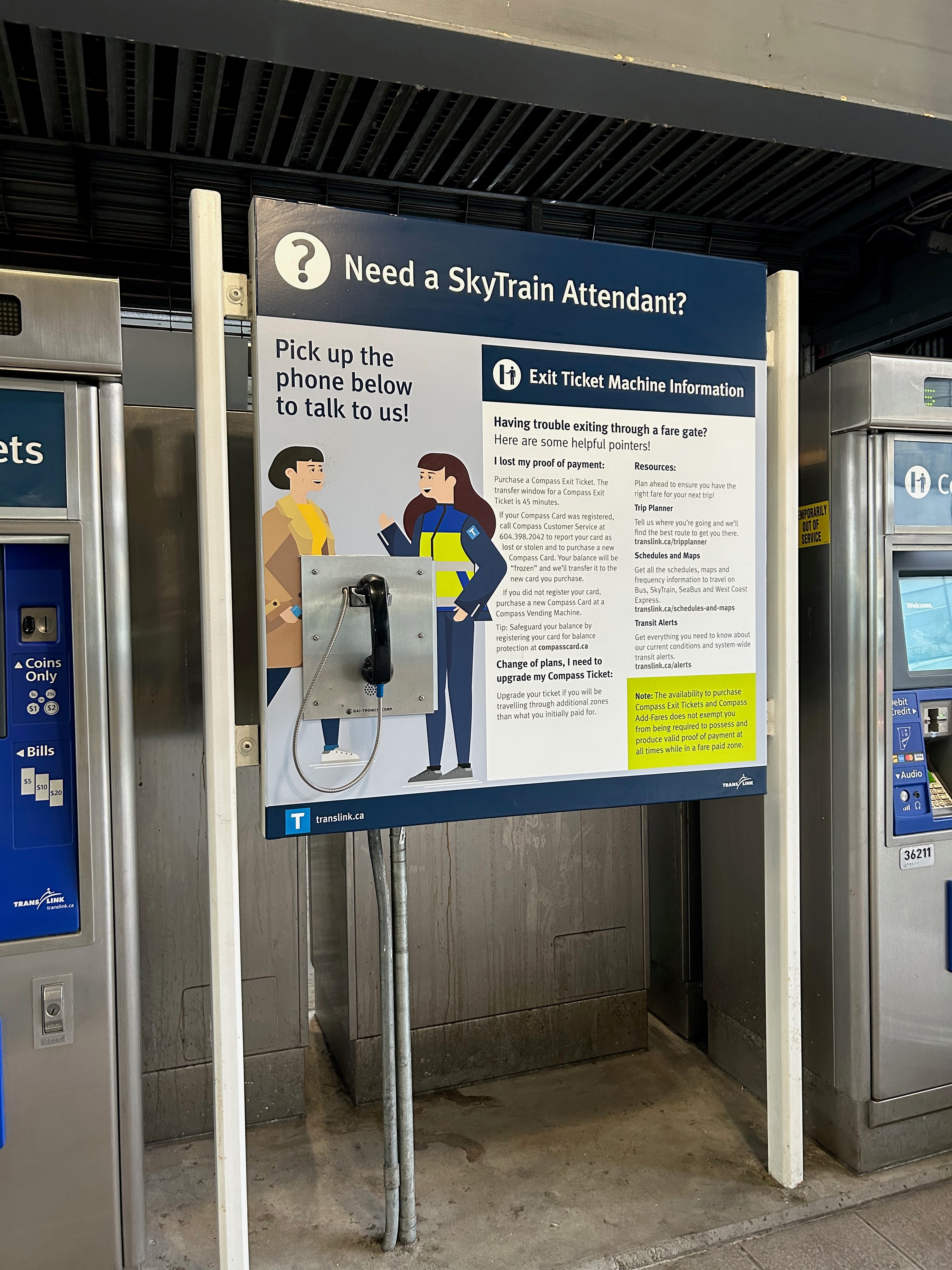
The question in particular was this: what font does TransLink use? Well, fortunately TransLink told us in 2010 that it is FF Meta. It forms the basis of nearly all fonts or typefaces used in the TransLink system and even the ‘T’ logo is from it.
Starting around 2010, the transit agency began to standardise its signage across the system although except (sort of) for the Canada Line, but I’ll explain this in a bit. Before, the system was distinguishable from its BC Transit predecessor but it still had a lot of features lingering over and one of them was having so many different typefaces. This was part of TransLink’s 2040 plan and in 2011, they released a guide on the subject of wayfinding.
Prior to 2010, you’d see a mix of Helvetica and Times Roman. In fact, FF Meta’s mere existence is as its author, Erik Spiekermann puts it: “[the] complete antithesis of Helvetica”. I guess TransLink hated Helvetica because I rarely see it outside of advertisements or the odd thing some employee prints out that doesn’t conform to the style guide.
The use of FF Meta elsewhere isn’t unheard of. The Stockholm Metro and Caltrans both use it as part of their system. A very similar font, FF Transit is in use by the Société de transport de Montréal (STM).
One interesting thing I learnt while researching all of this is that the provincial government has its own typeface: BC Sans. It was introduced in 2018 as an initiative to standardize content viewed on websites and to provide support for indigenous languages.
The use of FF Meta or BC Sans is not unheard of. In the late 1960s, the Canadian federal government came to the realization that having consistency across government agencies and departments was important, so in 1970 the Federal Identity Program was created.
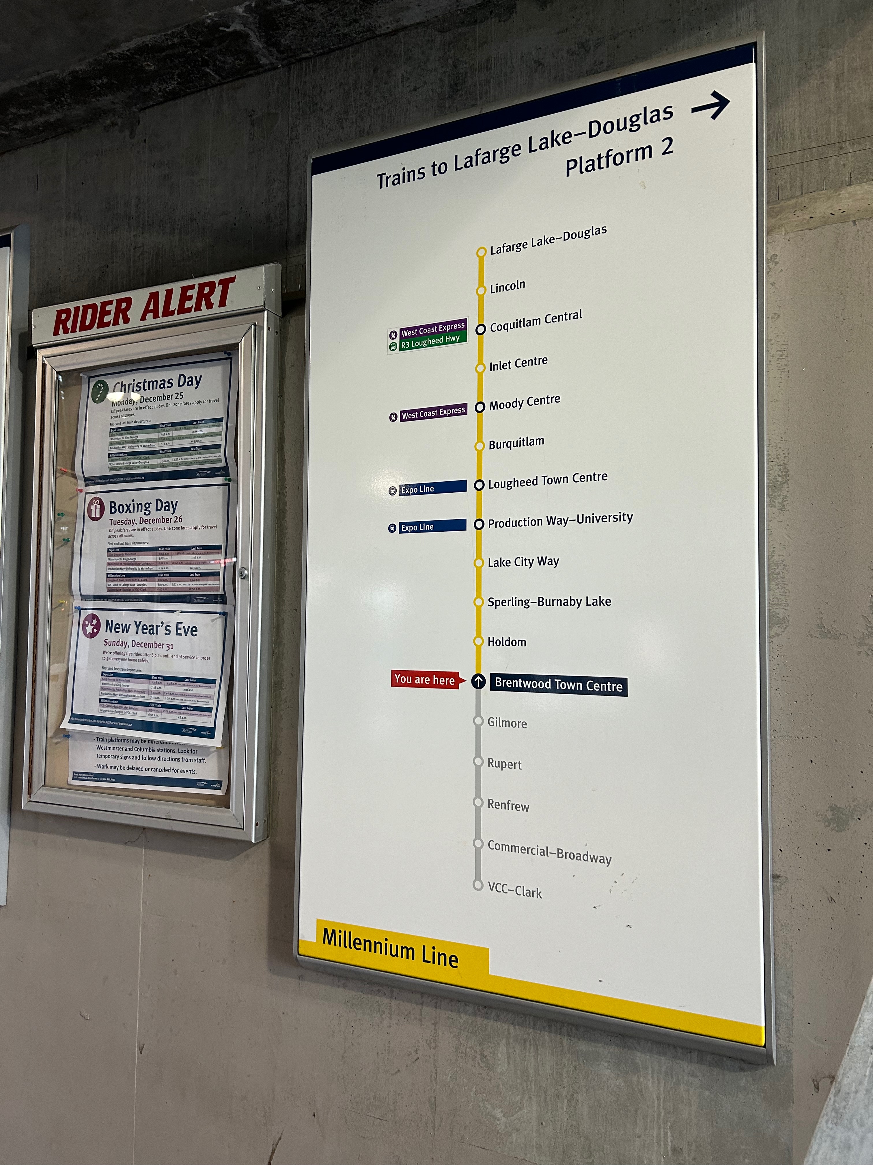
TransLink for a long time really had a lot of inconsistency with graphic design across its services. You’d look at the West Coast Express and see that it was very different from the three SkyTrain lines and then you’d also see the buses not matching either. So the choice of a common typeface, design language, and livery across the whole TransLink network made sense.
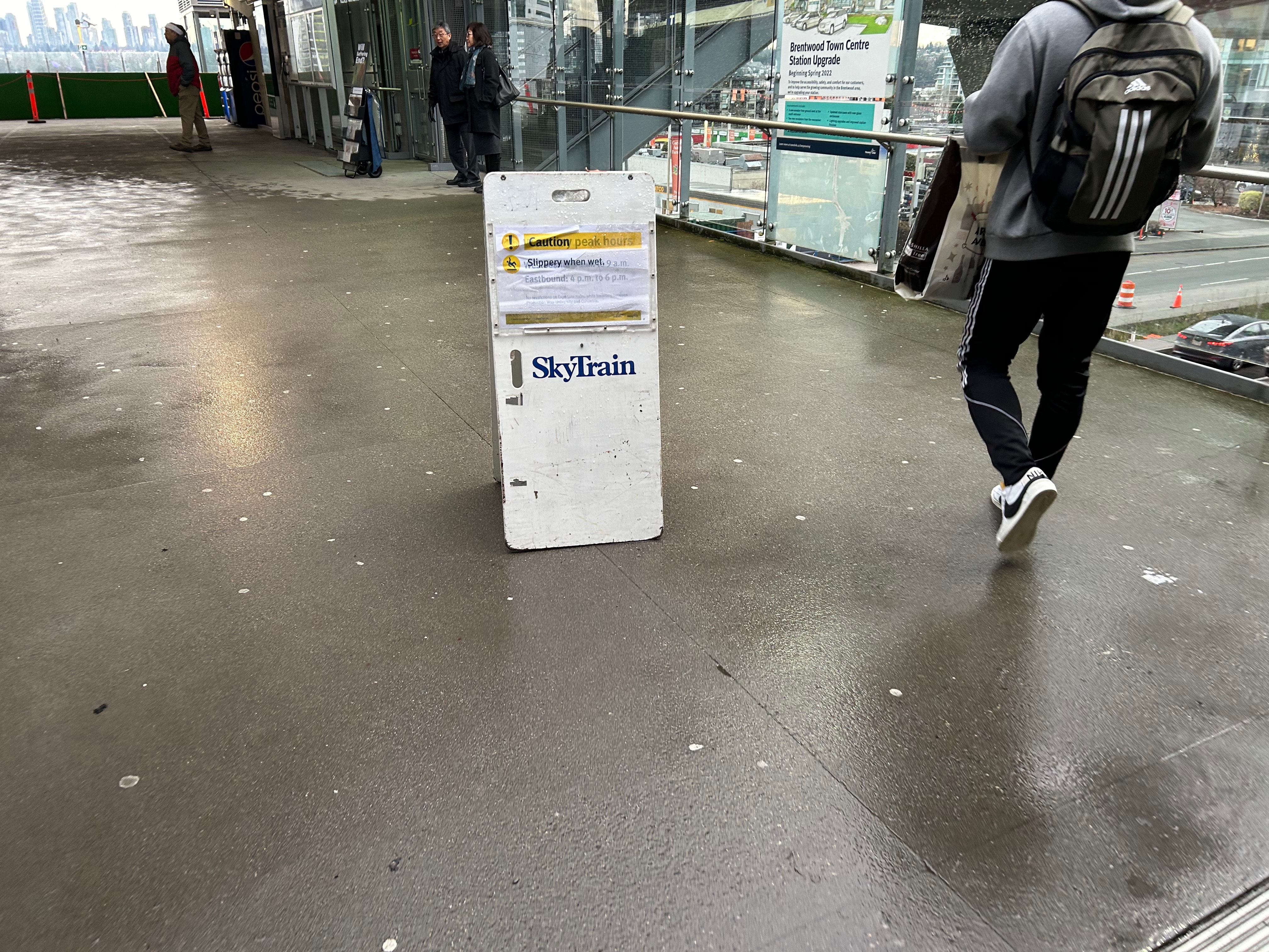
Even to this day there are some holdouts or the odd thing just sitting out in the open (there are still signs from the 2010 Winter Olympics languishing about at a few stations), but in the 13 years since TransLink has adopted the current typeface standard and design language, it has nearly replaced anything from its BC Transit past.
As for the Canada Line, it has to do with it not being completely under the control of TransLink. That said, some of the design language has crept into it and I am curious to see the new Capstan Way station once it opens to see what happens. If there is interest in why everything is weird with this line, let me know.
I do plan to talk about design language and transit in the future too, but for now enjoy using FF Meta.